
Red pines in Japan
Larger version

Before I went to Japan, I bought a beautiful pot. Inside it was a tragic triple-trunk black pine. The two smaller trunks were dead and the largest trunk was half dead. Years later, after the lone survivor regained vigor, it was time to give it some style.
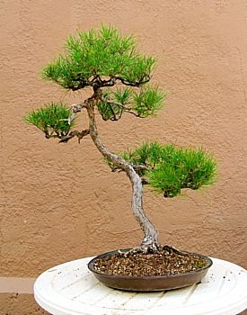
Black pine, inspired by red pine
Larger version
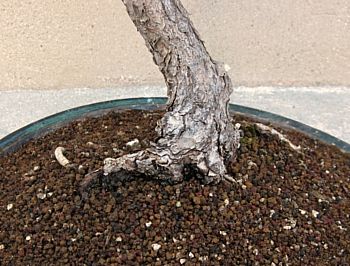
The nebari (surface roots) and base of the trunk had big gaps for the two other trees which no longer shared the space. Once the dead trees had been removed, what remained was unsightly. I liked the tree but hated the rootage.
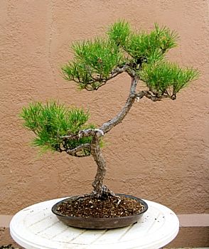
I took this improved-but-nothing-special tree to John Naka's class to get his take. He also zeroed in on the sad surface roots, calling them a distraction that would never work. He said the back would make a much better front. I had to agree that the rootage looked terrific. But the top two-thirds of the trunk leaned back and the branching was problematic. With his approach, I liked the rootage but hated the tree.
Every time I watered the tree, I hoped for inspiration. I wanted to show off the desirable rootage – but I struggled with the rest of the design, so I let the tree languish for a few years.
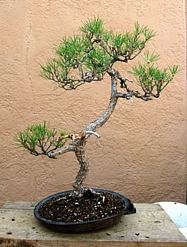
The transformation begins with a trim job
Larger version
Before a much-needed repotting, I made the changes necessary to turn the tree around. I reworked the trunk, removed the eye-poking lower branch, and changed the attitude a bit to bring the trunk more vertical and reduce its backward lean.
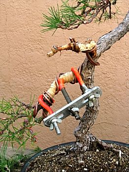
The lower-left branch was directionally challenged. Its primary branch was too straight and horizontal while the secondary and tertiary branching faced away from the viewer. The branch was wrapped in raffia before being repositioned down and toward the viewer. This one move gave the branch character and an embracing quality that harmonized nicely with the movement in the trunk.
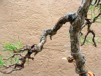
The lower-right branch had nice movement and character, but it was too horizontal for the new design. A small cut was made to the top of the branch where it exited the trunk. A wire, threaded through plastic tubing to protect the tree, was wrapped around the trunk and attached to the wire shaping the secondary branching. As the branch was pulled down toward the trunk, the guy wire was twisted to shorten it and hold the branch down. The cut at the trunk was then sealed.
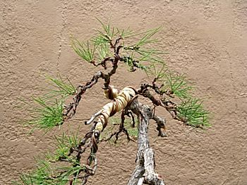
More raffia was wrapped around upper branches that needed major movement. The longest branch mimicked the flow of the trunk and the lower-left branch. The backward-leaning apex was coiled to the left and forward to improve its position relative to the base of the trunk. The visual interest of added depth and movement enhanced the aged character of the new design. Unfortunately, three branches along the raffia route are positioned too closely together along the trunk.
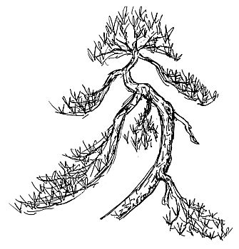
The right branch will eventually be removed when its younger sibling above grows up. This will cut down on the congestion and allow your eye to enjoy the gentle movement in the trunk.
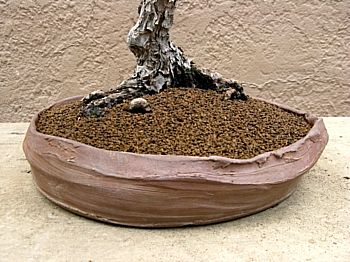
A new beginning for the new front in its new home! The rootage may not be perfect, but it's strong, stable, radiating, and embracing – a huge improvement from the previous front.
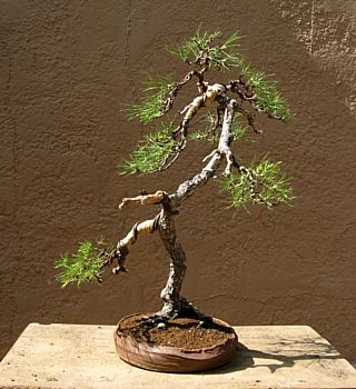
One good turn leads to one good tree
Larger version
Shaping the branches and apex to turn this tree around give the tree more character and age. Although it no longer reminds me of the red pines along the Sea of Japan, I now love both the tree and the rootage.
John Naka wanted me to give this tree a 180° turn. As always, his analysis was spot-on. Perhaps I should examine the backsides of the rest of my collection.
[ Top of page | Go back | Go forward | "Trash to Treasure" contents | Site contents | Home | ]